![]()
Thoughts on Black & White Drawings
I have always enjoyed working in black and white, both in art and photography and it had become an ambition to start drawing in the middle of a large sheet of paper, without having any preconceived plan, and see what happened. One day in August 2009 I took a full sheet of my favourite Fabriano hot pressed paper and did just that.
My normal method of working had always been to plan everything more or less down to the very last detail, scaling up from small pencil sketches which might in themselves have taken some days to produce. To start with a pen in the middle of such a huge expanse of white paper was, for me, quite scary. Starting is always the most difficult part of any new work, I find, and this was particularly difficult since those first marks, which could not be erased, might make or mar the whole project. Being an absolute control freak doesn’t help in these situations! After a minute or two however I started to draw an artist sitting at a drawing board and soon became absorbed in the strange scene that gradually emerged before me.
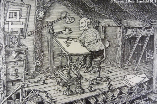
By the time I’d finished drawing this chap’s studio and started to work outwards, adding surrounding detail, the control freak in me kicked in. Definite ideas started to form in my mind once work had commenced and I didn’t want to run the risk of spoiling the drawing. The pen was put aside, and a pencil used to rough out the detail which was inked over later. This is how things progressed, so that at any one time the paper contained several rough pencil outlines and handwritten notes, more detailed pencil work, simple ink outlines and completed ink areas. These grew out from the centre to gradually cover a 42 x 60 cm area of the sheet.

To begin with there were large areas of white paper and I still had absolutely no idea of what was going to occupy these while putting the final touches to other parts. For me this was a really crazy way to produce a picture, but it kept me interested right up to the final completion and I enjoyed the sense of freedom it gave me in that I was not tied into some pre-ordained design.
This first picture is a series of interlocking but separate scenes which might or might not be in some way connected to each other, entitled Gallimaufry. According to the dictionary this means a hotchpotch, which seems not only appropriate but a nice title for a picture.
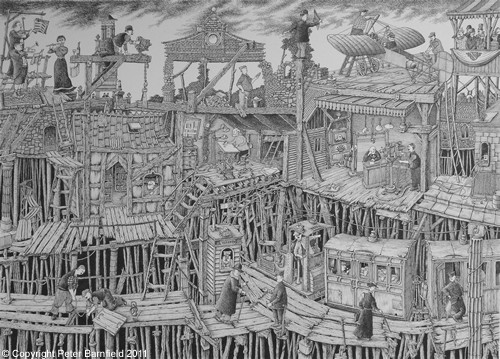
As I am a fairly slow worker Gallimaufry took about 14 days to complete, using a mixture of Rotring pen for all the main outlines and filling in detail hatching with 0·18 and 0·25 Mars Professional pigment ink felt tip pens. It led to a whole series of black and white drawings which, at November 2011, is still ongoing.
I don’t like working under pressure and prefer tinkering around with parts of a picture until being reasonably satisfied that it’s the best I can achieve. About the longest time I’ve ever spent on one of these black & white pictures is 28 days, which is what it took to complete The Darkness Shop. This drawing started out as quite a dense, dark and potentially depressing picture which was begun when I’d virtually lost my hearing due to a virus.
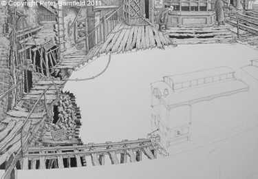
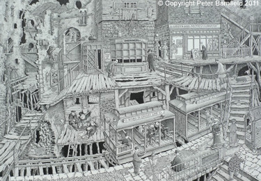
Being trapped in a world of silence not only made me appreciate what a terrible handicap deafness is, but also produced a very claustrophobic scene which nevertheless cheered up a lot as my hearing gradually started to return. I have absolutely no idea of what goes on in either of the shops featured, or exactly how Messrs. Light & Son purvey illumination, but suspect there is something to do with the battle between light and darkness, good and evil, going on hereabouts!
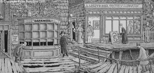
Whether moods or feelings really do actually influence one’s visual work is an interesting topic which would no doubt produce various conflicting opinions. Many of my pictures might at first glance appear to be a trifle gloomy, but that is certainly not a reflection of how I’m feeling at the time they were completed. In any case, I like to think that there is humour hidden in the detail.
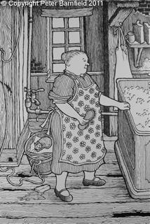
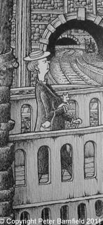
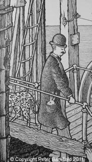
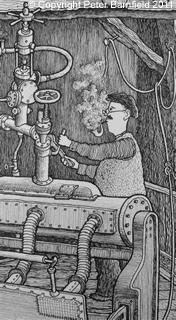
There are some quite happy and seemingly contented people populating the different levels in The Darkness Shop for instance, and characters in all my pictures inevitably go about their business with a calm self assurance, despite the situation or any apparent impending catastrophe.
The Darkness Shop was completed entirely in Mars Professional pigment pens and illustrates the technique of producing an almost tonal result by turning a partly worn pen slightly on its side and scribbling quickly and very lightly. Below can be seen the effect in the detail of the front of the Round-in-Circles-Line train, the bearded busker and in many other parts of this picture. Even the so called black pigment ink pens give a non-black image. Compared to Rotring ink it is much softer and, since the Fabriano paper used is far from white, the appearance, when framed using a white mount, has a somewhat vintage feel which is maybe in keeping with the subject matter.
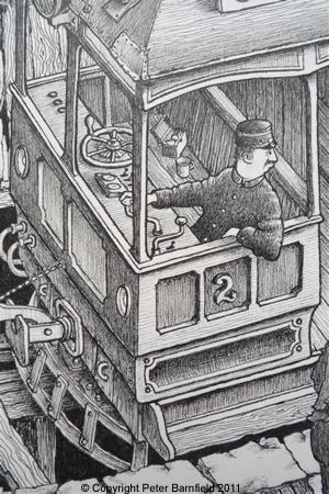
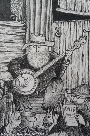
Having begun to enjoy using these Mars pens I purchased a small stock of them, only to discover when trying to order more, that they had been discontinued! This is always happening to me, first with some favourite coloured pencils, then with the brilliant Rotring rapidoliner pens, with their disposable long life cartridges which I used for years.
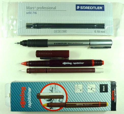
The Rotring refills contain enough ink for several drawings, the pens are well balanced, comfortable to hold for long periods and extremely clean to use. I’ve also employed them in conjunction with watercolour, as the ink is waterproof, and now wish I’d laid in a large stock of them before it was too late. The actual pens I’m currently using were found at a car boot sale by one of the sales assistants at my art supplies shop. She saw them, thought of me and offered them to me for the price she’d paid for them, a very nice gesture!
During 2011 I’ve worked almost exclusively in black & white, producing a number of smaller pictures which are not as time consuming as the larger variety. Some artists will doubtless laugh at my insistence on calling 42 x 60 cm large, but it’s all a question of scale, and I’m not at all sure of my ability to spend much more than a month looking at one sheet of paper! These smaller pictures are slightly different in composition in that I start with a fairly definite idea of where the picture is intended to go and its main subject matter.
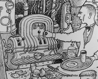
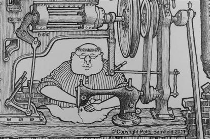
I usually start with a key area, such as the coffee machine in Café Noir Blanc, the sewing machine in Repairs and Alterations or the organ in The Diligent Recordist, and work out from there. The larger Crotchet Court picture, on the other hand, started with the shop front of O’Harp & Son and what was going to occupy the rest of the picture was a complete mystery to me until it gradually assumed some sort of order on the paper.
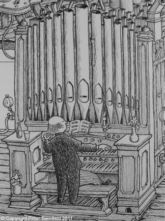
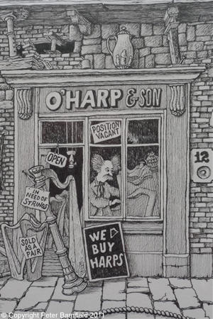
At the time of writing my most recent work, The Justification of Minutes, (below) has just been filed away in the plan chest. This is a 32 x 45 cm picture which shows minutes of various meetings being written by clerks using quill pens at bottom left. These gradually work their way up to the company board room at top left, for ‘matters arising from the minutes,’ before being passed to the filing department top right. The minutes are in actual fact fed straight into a shredder and pass down through a paper making machine to emerge as clean sheets to be used by the clerks to write yet more sets of minutes. As with many of my pictures, the clothing worn by each of the people either denotes their status or clearly identifies their particular department or job. Although the machinery is driven by electricity, the setting, in common with most drawings, is probably sometime in the early 20th century.
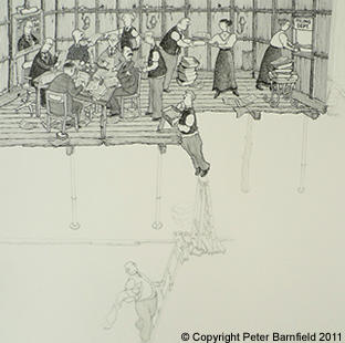
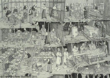
It was my intention to photograph this picture as it progressed, but having taken the first photograph I completely forgot about continuing the process! For the record, I progressed down to the middle floor left, then back to top floor right, down through the paper making and back to finish in the bottom left corner.
This picture was completed on November 3rd 2011, using the very last pair of Rotring rapidoliner pens in my drawer, 0·18 & 0·25. Future pictures will have to be drawn using the rapidograph pens which are not nearly so nice to hold for long periods and whose stubby barrels simply don’t balance well in the hand. As for pigment ink pens, although there is a selection on the market I’ve yet to find anything that gives the same quality of line as the discontinued Mars Professionals.
Since this was written our son Ian has spent some time trawling on eBay and managed to replenish my stock of discontinued Rotring and Mars refills. With incredibly perfect timing the Rotrings arrived on the day before my very last ·25 ran dry!